
Kitchen Lot is a new restaurant brand developed as an extension of Café Lot.
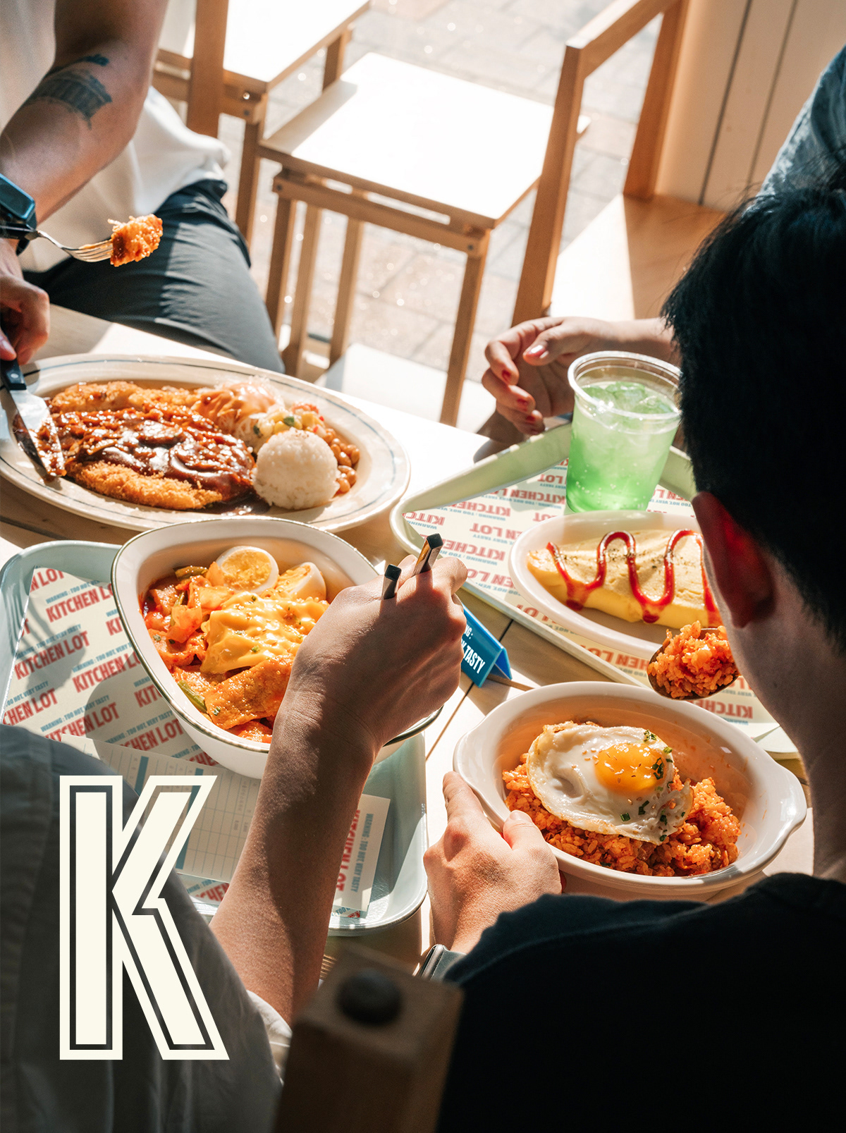
Upon Café Lot’s philosophy of providing simple, convenient, and approachable experiences, Kitchen Lot reinterprets the concept into a casual dining space designed for busy office workers.
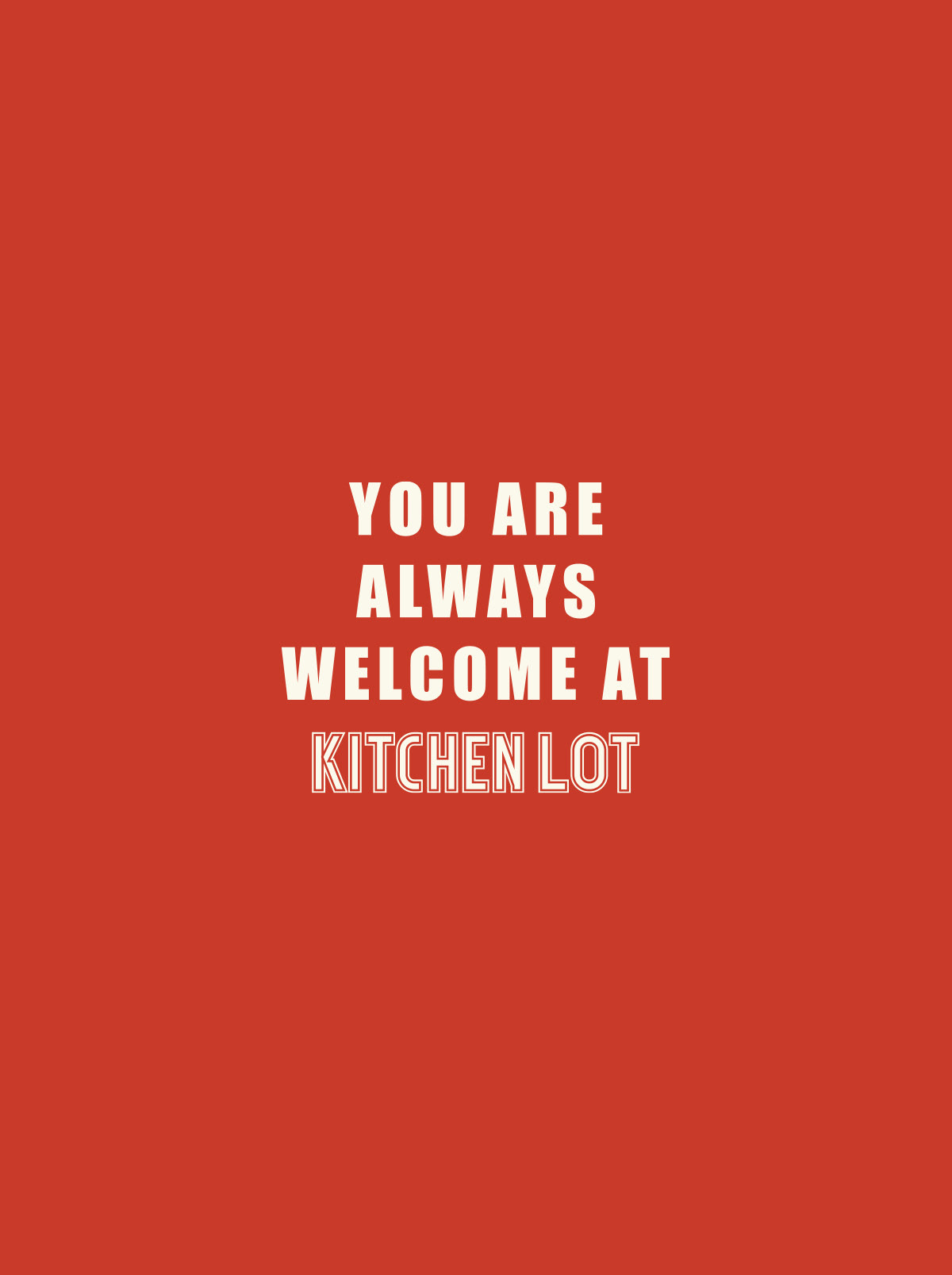
Inspired by the atmosphere of American diners, Kitchen Lot focuses on a sense of familiarity and warmth rather than overly polished perfection. The brand embraces a human-centered approach, creating a space that feels witty, approachable, and naturally connected to everyday life.
Visual Identity
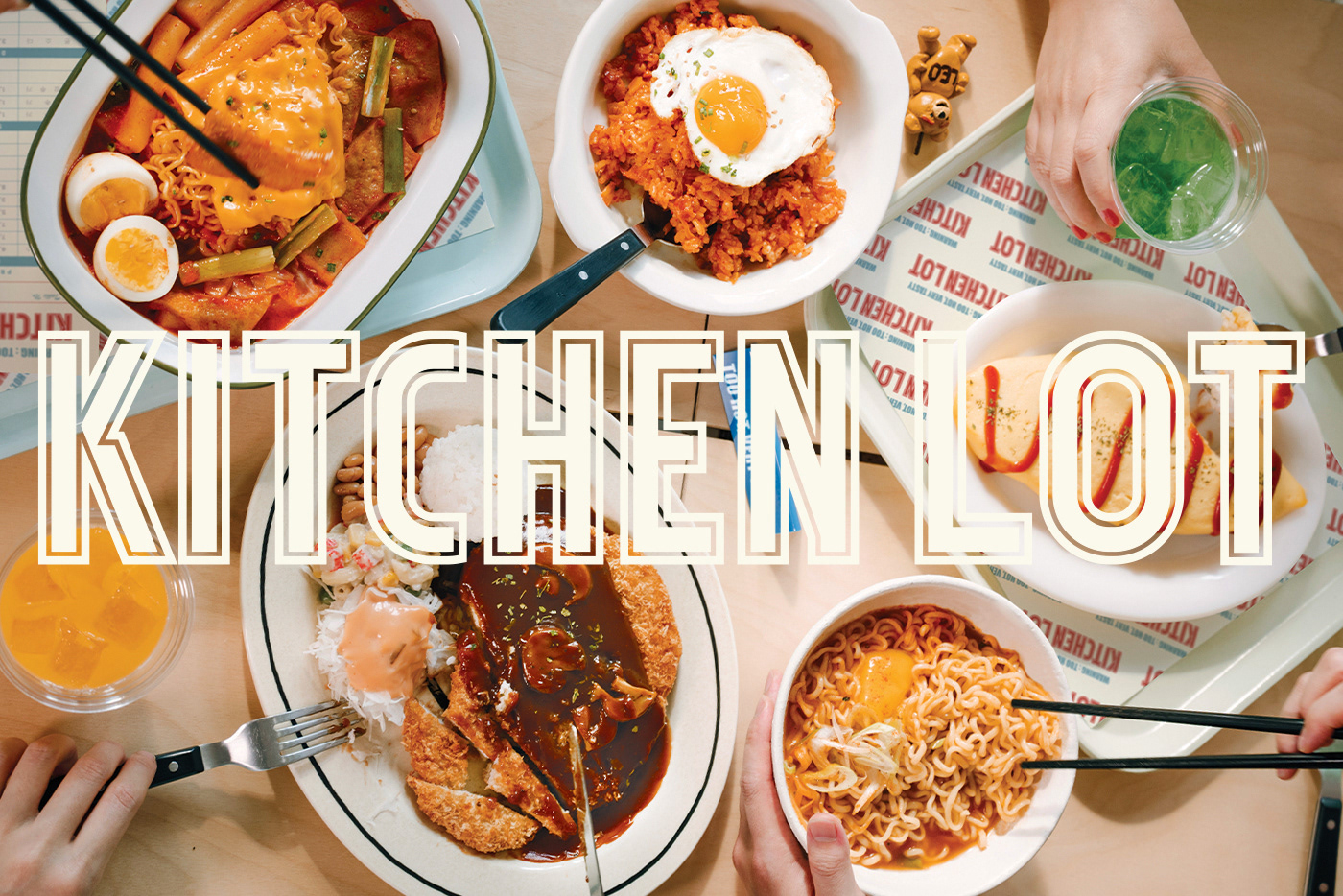
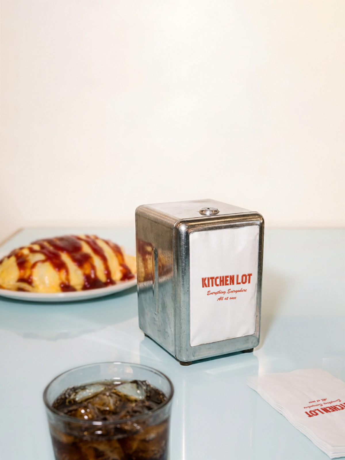
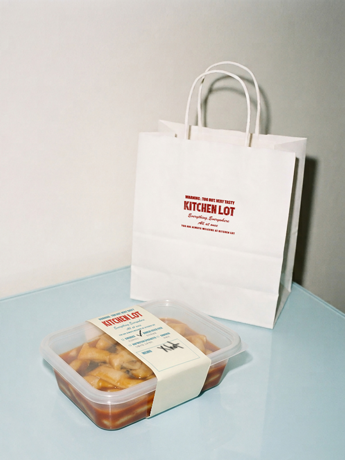
The logo was designed with a bold and confident wordmark, expressing the brand’s key characteristics: efficient service, reasonable value, and strong appeal.
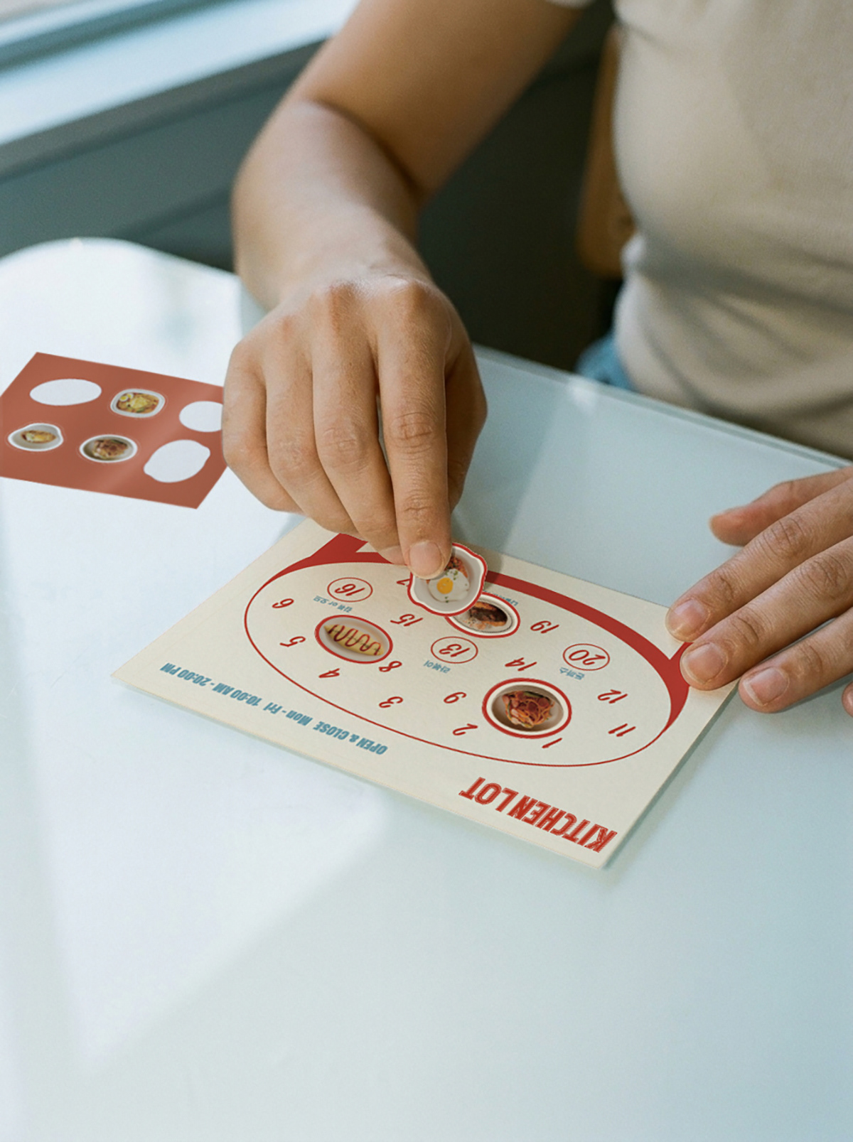
To maintain a subtle connection with Café Lot, the original blue brand color was carried over as a secondary color within Kitchen Lot’s visual system. This allowed the two brands to feel connected while maintaining their own distinct personalities.
Brand Experience
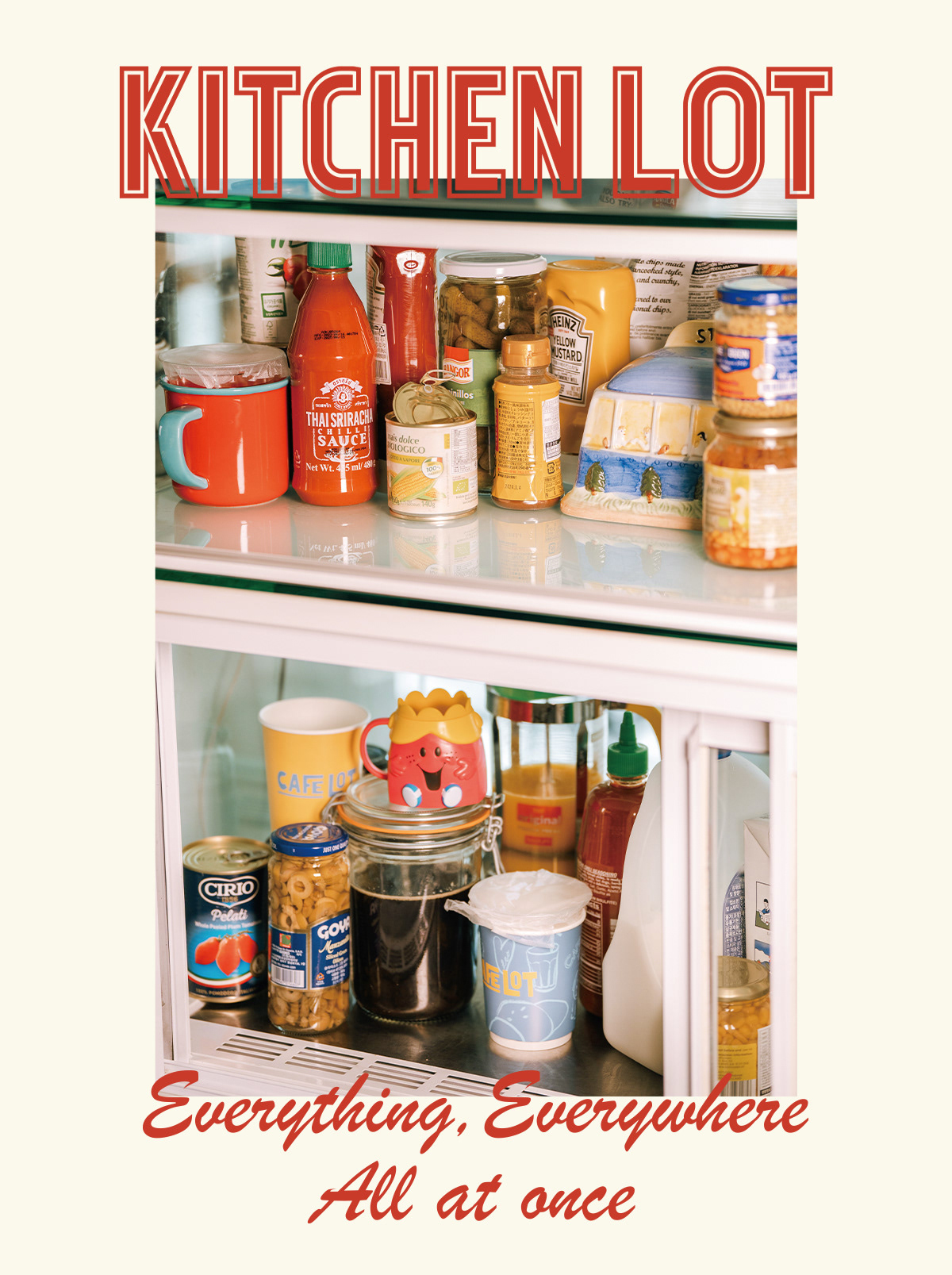
The tagline “Everything, Everywhere, All at Once” captures Kitchen Lot’s identity as an accessible dining destination where office workers can quickly and comfortably enjoy a satisfying meal anytime.
Through the overall brand expression, Kitchen Lot communicates the feeling of a place people naturally return to - a familiar neighborhood spot with comforting flavors, a welcoming atmosphere, and a sense of everyday connection.